Street Address
Los Angeles, CA
Phone Number
You're Custom Text Here
You're Custom Text Here
COMPANY: Anywhere Apparel is a versatile clothing company that makes high-end, sophisticated, and incredibly functional travel apparel enabling one to travel light and discover more.
PROJECT: Ivy & Ink created an icon with dual meaning to capture the essence of Anywhere Apparel's brand, which authenticates travel in all sorts of landscapes, from the rural outdoors to high-traffic city centers. While avoiding visual clichés often used in travel branding (like mountains, compasses or globes) and with the right amount of abstraction to represent the infinite possibilities of "anywhere," the organic leaf- or feather-like form represents the natural world and seamlessly compliments the angular lines and window-facade pattern seen in an urban landscape. This icon was built to look striking on its own and in small sizes for apparel trimmings and buttons. It also pairs well with the logotype and tag line when used for promotional pieces and apparel hang tags.
Upon finalization of the icon, Ivy & Ink curated six unique color schemes representing the Natural World and the Urban World. This icon built for Anywhere Apparel can truly be used anywhere.
CLIENT: William Seiser
PROJECT: In order to create a memorable calling card without a business name, logo, or brand materials, a monogram was created by combining W + S, our client's initials. This monogram can be applied as a classic logo mark to any print or digital stationery and helps our client stand out among the crowd.
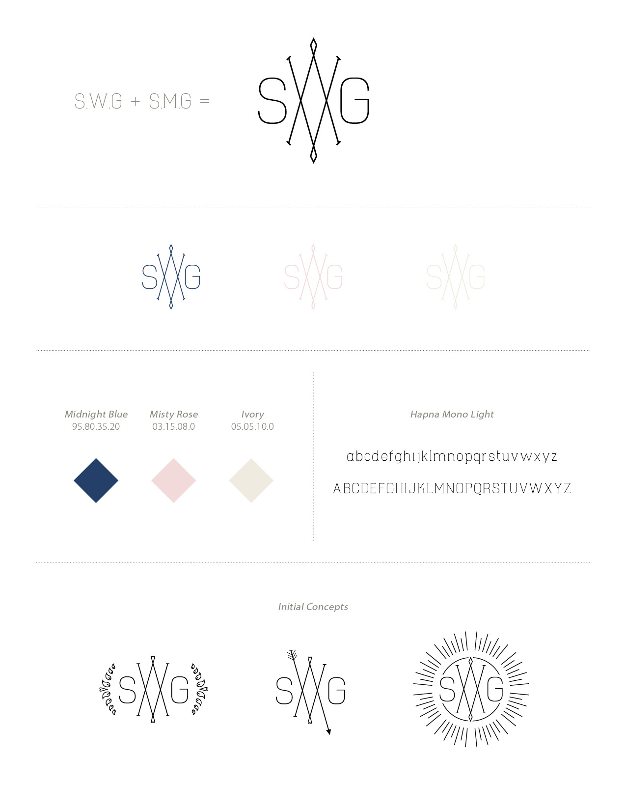
CLIENT: Sam and Sarah
PROJECT: This soon-to-be-wed couple requested a monogram for their upcoming wedding. The couple share the same first and last initials and their middle initials (W & M) are mirror letters, bringing a very fun challenge to Ivy & Ink. We created a clean, contemporary, Art-Deco-inspired dual monogram to be used for all materials in Sam and Sarah's wedding stationery suite and for their big day. The monogram will be used for envelope embossment, website customization, and cocktail hour and reception materials like custom napkins and signage.
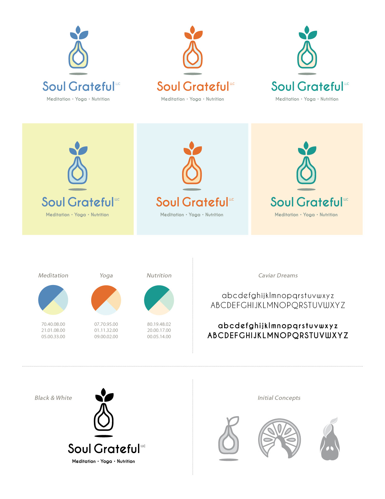
CLIENT: Soul Grateful, LLC offers health and wellness counseling and training, specializing in meditation, yoga and nutrition for individuals and groups.
PROJECT: With three unique company services that often coincide, a logo that represents all key features was created by combining abstract representations of a tree (personal growth), a fruit (nutritional health) and an individual reaching upwards (yoga/meditation). This logo effectively represents Soul Grateful's teachings of wellness, healing, support, growth, openness, energy.
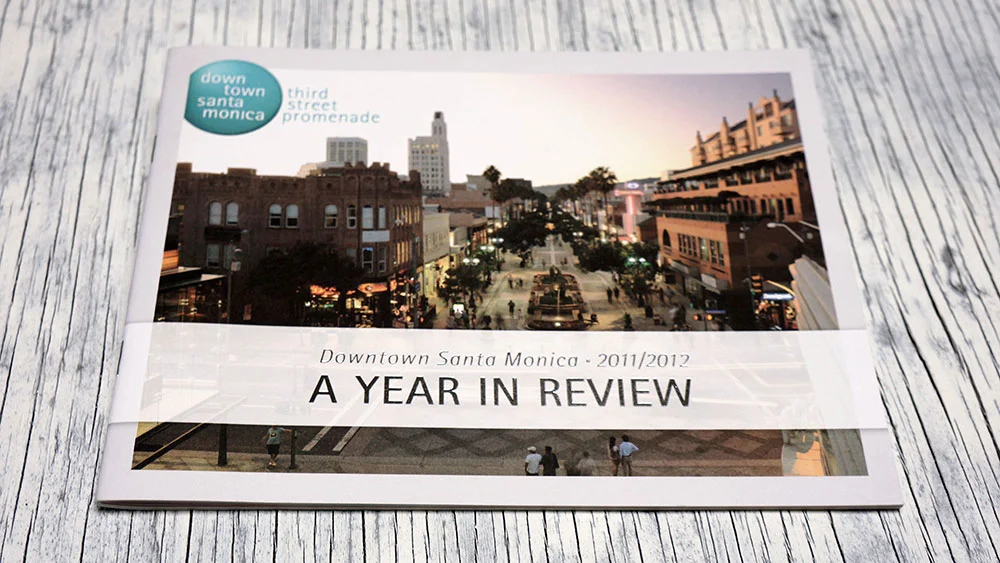
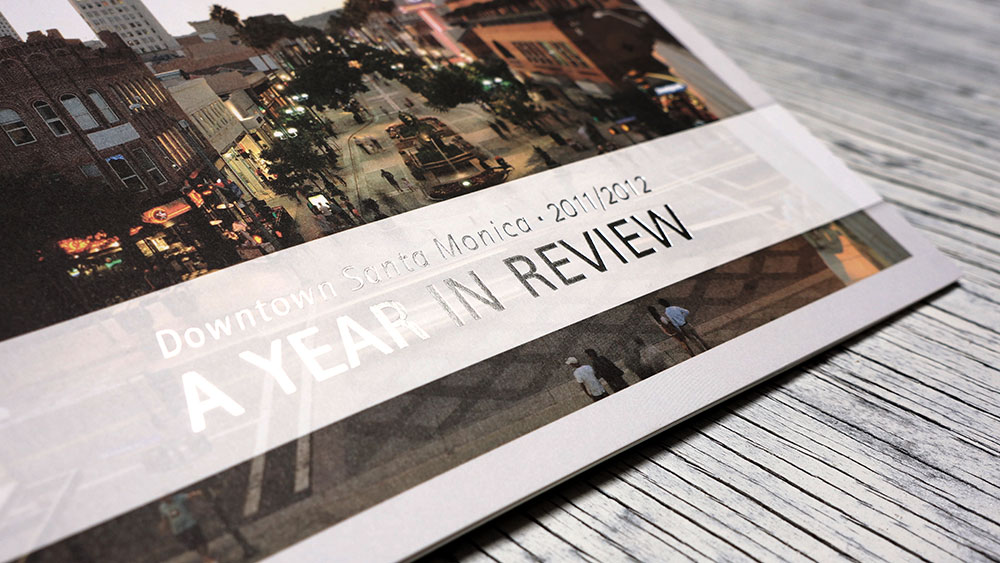
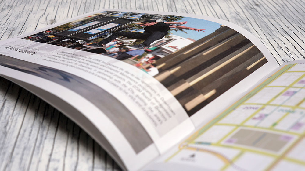
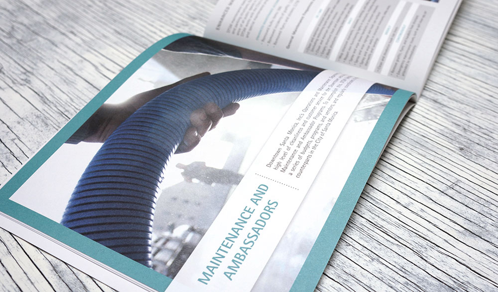
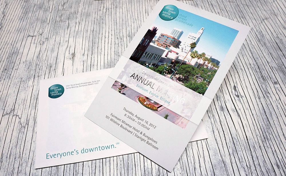
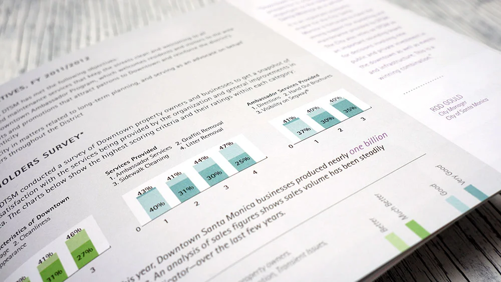
COMPANY: Downtown Santa Monica, Inc. is a private, non-profit organization that works with the City of Santa Monica to improve public amenities, services and the overall quality of life for Downtown patrons while also promoting shopping, dining and entertainment.
PROJECT: This report was designed to hold an extensive amount of services data while retaining Downtown resident and stakeholder engagement. Another priority was to keep the project low-budget due to stakeholder interests. A high-end, user-friendly look was accomplished through the strategic use of brand colors to divide content for easy navigation, the simple and clean art direction, and the foil embossed cover for attractive, yet low-cost, embellishment.
SUPPORTING PROJECT MATERIALS:
• 'Save the Date' Annual Meeting Postcards
• Foil embossed Annual Meeting Invitations (pictured)
• Annual Meeting Event Signage and Microsoft PowerPoint elements
PRODUCTION: Ivy Brown of Ivy & Ink as Art Director with Striker Media handled all art direction, project management and design, pre-production, and print facilitation, including multiple press checks.
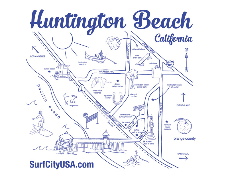
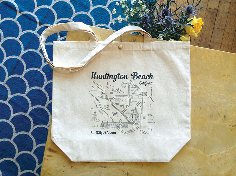
COMPANY: Visit Huntington Beach is a marketing and visitors bureau representing the preferred California beach destination, SurfCityUSA®.
PROJECT: This detailed pictorial map was custom illustrated for Visit Huntington Beach's promotional marketing pieces. In addition to a contextual map of the major roads, highways and nearby cities, individual custom illustrations highlight all the fun points of interest and activities you can enjoy in Surf City USA®. The tote bag serves as a unique, informative and functional marketing piece, to be given out at trade shows, destination sales meetings or to local visitors and familiarization tour attendees.
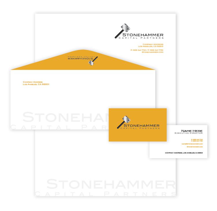
COMPANY: A potential startup investment company.
PROJECT: Commissioned during the initial phases of a potential small company startup, this logo served as a concept design. Ivy & Ink also created identity collateral to explore the brand possibilities.
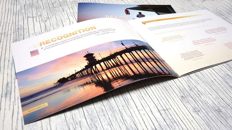
COMPANY: Visit Huntington Beach represents the surfing capital of the world and works hard to market all that classic California's Huntington Beach has to offer to visitors and the world's tourism industry.
PROJECT: Visit Huntington Beach, formerly Huntington Beach Marketing and Visitors Bureau, was in the middle of a brand redesign. This annual report design needed to embody the destination without utilizing the current branding. It was also essential for their annual report to display a large amount of information regarding their marketing and sales efforts yet retain a design that was clean and beautiful, for easy content perusal.
PRODUCTION: Ivy Brown of Ivy & Ink as Art Director with Striker Media handled all art direction, project management and design, pre-production, and print facilitation, including multiple press checks.
Fun Fact!
After this annual report was printed, Ivy Brown of Ivy & Ink was principal in the new logo design as Art Director with Striker Media Group. Currently, Ivy & Ink is working on implementing the new branding in Visit Huntington Beach's identity collateral. The business cards are hot off the press and can be seen here.
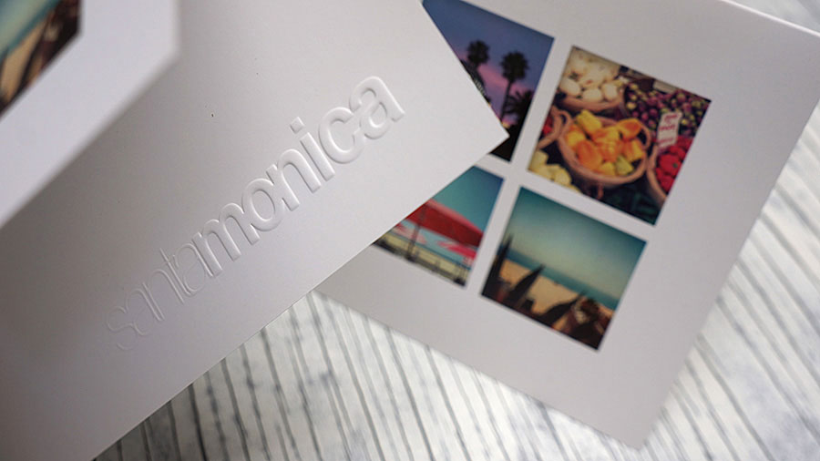
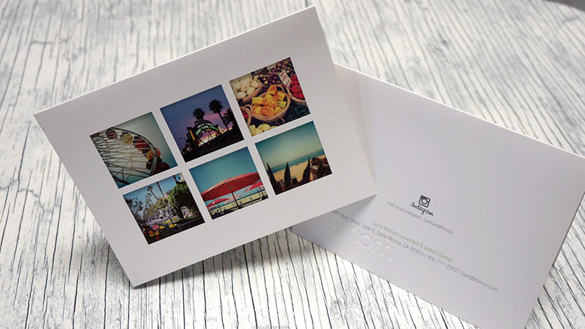
COMPANY: The Santa Monica Convention and Visitors Bureau represents Santa Monica as a conference, business and leisure travel destination, also offering programs to the local community. The organization's hard work has brought Santa Monica accolades such as one of "The Top 10 Beach Cities in the World" according to National Geographic Traveler.
PROJECT: The embossment detail, quality card stock and spot UV support an upscale stationery marketing piece. The card features the Santa Monica destination and iconic brand through on-trend Instagram® photos while remaining versatile for a multitude of uses within the organization. For additional brand marketing, SMCVB's Instagram tag is on the back, encouraging recipients of the card to upload their own Santa Monica Instagrams.
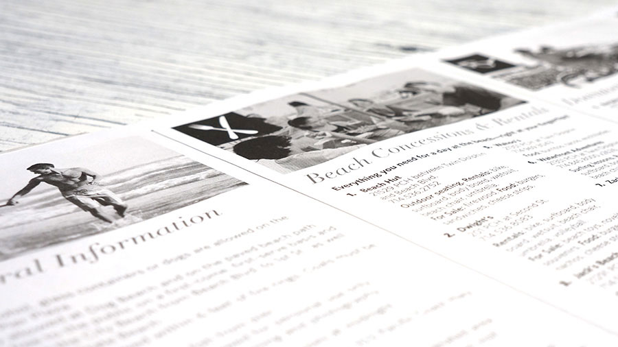
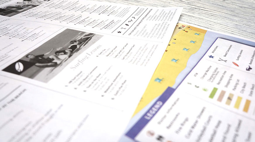
Used as a supplementary navigation and informational piece to the Visit Huntington Beach Visitors Map, this map, assembled as tear-off sheets on a pad, is ideal for visitor centers assisting in way-finding for visitors in Huntington Beach.
Ivy & Ink Contributions